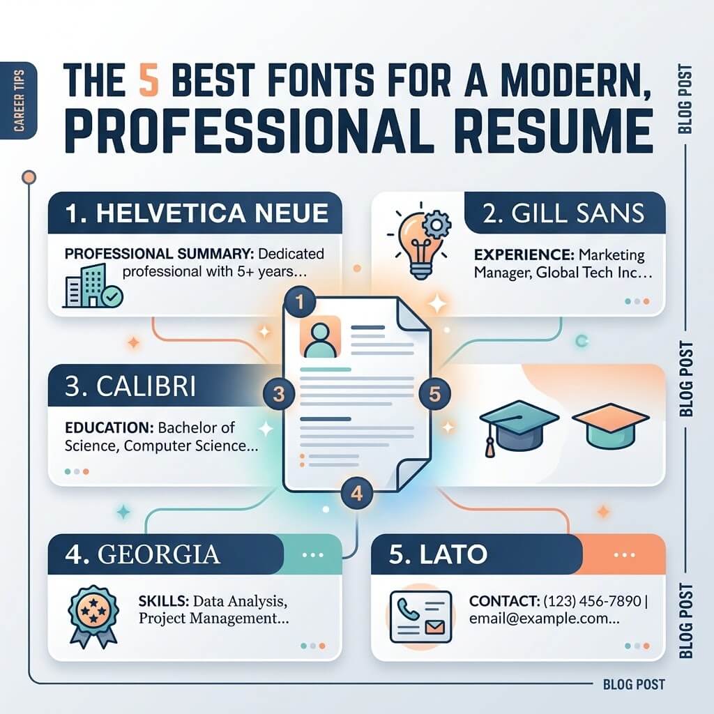
The 5 Best Fonts for a Modern, Professional Resume

Font choice is one of those resume decisions that feels minor until you actually sit down and try to make it. Open a word processor, scroll through the dropdown menu, and suddenly you’re second-guessing whether Calibri looks “too default,” whether Times New Roman reads as outdated, and whether that sleek sans-serif you liked is actually going to render properly once it hits an applicant tracking system. It’s a small design choice with an outsized psychological weight, because it’s the very first thing a reader’s eye processes — before a single word of your experience gets read.

Here’s the part most listicles skip: font choice isn’t really about looking “modern” for its own sake. It’s about legibility under real reading conditions (a six-to-eight-second scan, often on a small screen), compatibility with ATS parsing, and a subtle signal about how much care went into the document overall. A well-chosen font doesn’t get noticed consciously — it just makes the resume easier to read, which is the entire point.

This guide walks through five fonts that consistently perform well for resumes in 2026, why each one works, and — just as importantly — the reasoning you can apply to judge any font you’re considering on your own, rather than blindly following a list.

What Actually Makes a Font “Resume-Appropriate”

Before ranking specific fonts, it’s worth naming the criteria, because they explain why certain popular fonts (Comic Sans, decorative script fonts, ultra-thin display fonts) never make these lists, and why some surprisingly plain fonts consistently do.

Legibility at small sizes. A resume typically runs body text at 10–11pt. A font that looks elegant at 24pt in a logo can become cramped or ambiguous at 10pt — letters like “rn” merging visually into “m,” or a lowercase “l” becoming indistinguishable from a capital “I.”

Neutral, not decorative. A resume font’s job is to disappear into the background and let the content lead. Fonts with strong personality — heavy scripts, novelty shapes, exaggerated serifs — pull attention toward themselves and away from your actual qualifications.

Wide availability and rendering consistency. A font that isn’t installed on the reader’s device gets silently substituted, sometimes with layout-breaking results (text that no longer fits its allotted space, spacing that shifts). Fonts pre-installed on both Windows and Mac, or standard web-safe fonts, sidestep this risk entirely.

ATS compatibility. Some parsing engines handle certain fonts, especially highly stylized or condensed ones, poorly — this is a separate issue from character encoding, but exotic fonts occasionally correlate with resumes that also use other ATS-unfriendly design choices (text boxes, graphics), so sticking to standard fonts is part of a broader “keep it simple” strategy.

With those criteria in mind, here are five fonts that consistently satisfy all four.

1. Calibri

Calibri has been Microsoft Word’s default font for over a decade, which cuts both ways: it’s extremely safe and universally rendered correctly, but some career advisors argue it now reads as slightly generic simply because it’s everywhere. That criticism is somewhat overstated. A resume’s job isn’t to win a design award — it’s to be read quickly and taken seriously — and Calibri does both reliably.

Its rounded letterforms and slightly narrower character width make it comfortable to read at small sizes, and it has a genuinely professional weight without feeling stiff or old-fashioned. If you want the safest possible choice with essentially zero risk of rendering or ATS issues, Calibri remains hard to beat, even if it’s not the most distinctive option on this list.

Best for: conservative industries (finance, law, government, corporate roles) where safe and clean matters more than distinctive.

2. Garamond

Garamond is a serif font with genuine historical pedigree — its design traces back centuries — but it reads as refined rather than dated, largely because of its narrow, elegant letterforms and generous spacing. It’s a favorite among career coaches specifically because it manages something unusual: it fits more text per line than many comparable fonts at the same point size, without looking cramped, which makes it genuinely useful for anyone fighting to compress content onto one page.

The tradeoff is that serif fonts in general read as slightly more traditional than sans-serif options, which can be an asset or a liability depending on the field. For academic, editorial, legal, or research-oriented roles, that traditional quality reads as appropriately serious. For a fast-moving tech startup, it might feel like a slight mismatch in tone.

Best for: academic, legal, editorial, and research roles, or anyone needing to fit slightly more content without shrinking the font size.

3. Helvetica (or Arial as a Substitute)

Helvetica has a reputation as one of the most universally “correct” fonts in graphic design — clean, neutral, endlessly versatile, and used across everything from corporate branding to subway signage precisely because it disappears into function. On a resume, that neutrality is exactly the point: nothing about the letterforms distracts from the content, and it reads clearly at essentially any size.

The catch is availability — Helvetica isn’t pre-installed on Windows by default, which is why Arial, a very close (if slightly less refined) equivalent, became the practical substitute for most job seekers. If you’re on a Mac and can access true Helvetica, it’s a small but real upgrade in visual quality over Arial. If you’re not sure your file will be opened on a Mac, Arial guarantees the same clean effect without the substitution risk.

Best for: tech, design-adjacent, and modern corporate roles where clean and minimal signals competence without extra effort.

4. Georgia

Georgia was originally designed specifically for on-screen readability, which makes it a strong choice in an era where the overwhelming majority of resumes are read on a screen rather than printed. It’s a serif font like Garamond, but with sturdier, more open letterforms designed to hold up at smaller sizes on lower-resolution displays — which, practically speaking, describes most laptop and phone screens a recruiter might be scanning your resume on.

Georgia carries a bit more visual weight and warmth than Calibri or Arial, which some job seekers find gives their resume a touch more personality without sacrificing professionalism. It’s a strong middle-ground choice between the strict neutrality of a sans-serif and the more formal tone of Garamond.

Best for: roles where the resume is overwhelmingly likely to be read on-screen rather than printed — which, in 2026, is most of them.

5. Lato

Lato is a newer, humanist sans-serif that’s become popular in both web design and resume design over the past several years, and for good reason: it strikes an unusually good balance between the clinical neutrality of Arial and the warmth of a more rounded font like Calibri. Its letterforms have subtle organic curves that make long blocks of text feel slightly friendlier to read without tipping into informal territory.

It’s also widely available as a free, open-source font (via Google Fonts), which matters if you’re building your resume outside of Microsoft Word — many browser-based resume builders and design tools include it by default. Because it’s a less common choice than Calibri or Arial, it can help a resume feel slightly more considered and current without taking any real risk on legibility.

Best for: creative, marketing, and modern corporate roles where a font with a bit more warmth and contemporary feel is an asset rather than a liability.

Original Framing: Match the Font to the Reading Context, Not Just the Industry

Most resume font advice stops at “match your font to your industry” — serif for law, sans-serif for tech, and so on. That’s a reasonable starting heuristic, but it misses a more useful variable: how your resume is actually going to be read.

If you know your resume is being uploaded directly into an ATS and will likely be viewed as a parsed, reformatted text block by a recruiter (common at large companies with high application volume), your font choice matters less than your structural formatting, since the original typography may not even survive the parsing process. In that case, prioritize a font that’s maximally ATS-safe over one that’s maximally elegant — Calibri or Arial over Garamond, for instance.

If you know your resume is likely to be opened as a genuine PDF by a hiring manager at a smaller company, or forwarded directly by a referral, your typography matters much more, since the reader will see your actual design choices. In that case, a slightly more distinctive font like Lato or Georgia can genuinely help you stand out in a stack of otherwise-identical Calibri resumes, without sacrificing professionalism.

This is a more useful lens than industry alone, because it accounts for the reality that two people applying to the same “tech industry” job might be going through completely different reading pipelines — one through a high-volume corporate ATS, one through a small startup’s direct email inbox — and the right font choice isn’t necessarily the same for both.

Fonts to Avoid, and Why

Times New Roman. Not because it’s illegitimate — it’s a perfectly legible, classic serif — but because it’s become strongly associated with default, unedited documents (it was the default font in Word for years before Calibri replaced it). Using it can unintentionally signal that little thought went into the resume’s presentation, even if that’s not true.

Comic Sans and other novelty fonts. These read as unserious in almost any professional context and can actively undermine an otherwise strong resume. This should go without saying, but it remains a surprisingly common mistake among less experienced job seekers.

Ultra-thin or ultra-bold display fonts. Fonts designed for headlines or logos, not body text, tend to sacrifice legibility at small sizes in exchange for visual impact — exactly the wrong tradeoff for a document meant to be scanned quickly.

Condensed or narrow fonts used purely to fit more text. As covered in resume length and formatting discussions elsewhere, using a condensed font specifically to cram more content into a fixed space usually creates a harder-to-read document and can look like an obvious space-saving hack rather than a genuine design choice.

Script or handwriting-style fonts. Even used sparingly (for a name header, for instance), these introduce legibility risk and a level of informality that rarely matches professional context, regardless of industry.

Practical Guidance for Choosing and Testing Your Font

Once you’ve picked a font from this list (or a similar one), don’t just trust it in isolation — test it the way it’ll actually be read. Print the resume if there’s any chance it’ll be printed for an interview panel. View it at actual size on a laptop screen, not zoomed in while editing. If you’re applying through an online portal, try the copy-paste test described in ATS-formatting guides: copy your resume’s text and paste it into a plain text box to confirm nothing breaks in translation.

Keep your font choice consistent throughout the document — using one font for headers and a different one for body text can work in professional design, but it’s a risk most job seekers don’t need to take. A single, well-chosen font used consistently, paired with strategic use of bold and size variation for hierarchy, will outperform a multi-font resume in nearly every case.

Key Takeaways

  • The best resume fonts are legible at small sizes, neutral rather than decorative, widely available across devices, and ATS-friendly.
  • Calibri and Arial remain the safest, most universally compatible choices, especially for conservative industries or high-volume ATS applications.
  • Garamond and Georgia offer a more refined, traditional feel — Garamond for academic and legal fields, Georgia for strong on-screen readability.
  • Lato offers a modern, slightly warmer alternative to the more common defaults, well suited to creative and marketing roles.
  • Match your font choice to how your resume will actually be read — ATS-parsed versus directly opened as a PDF — not just to your industry.

Avoid Times New Roman (dated association), novelty fonts, ultra-thin display fonts, and condensed fonts used purely to save space.
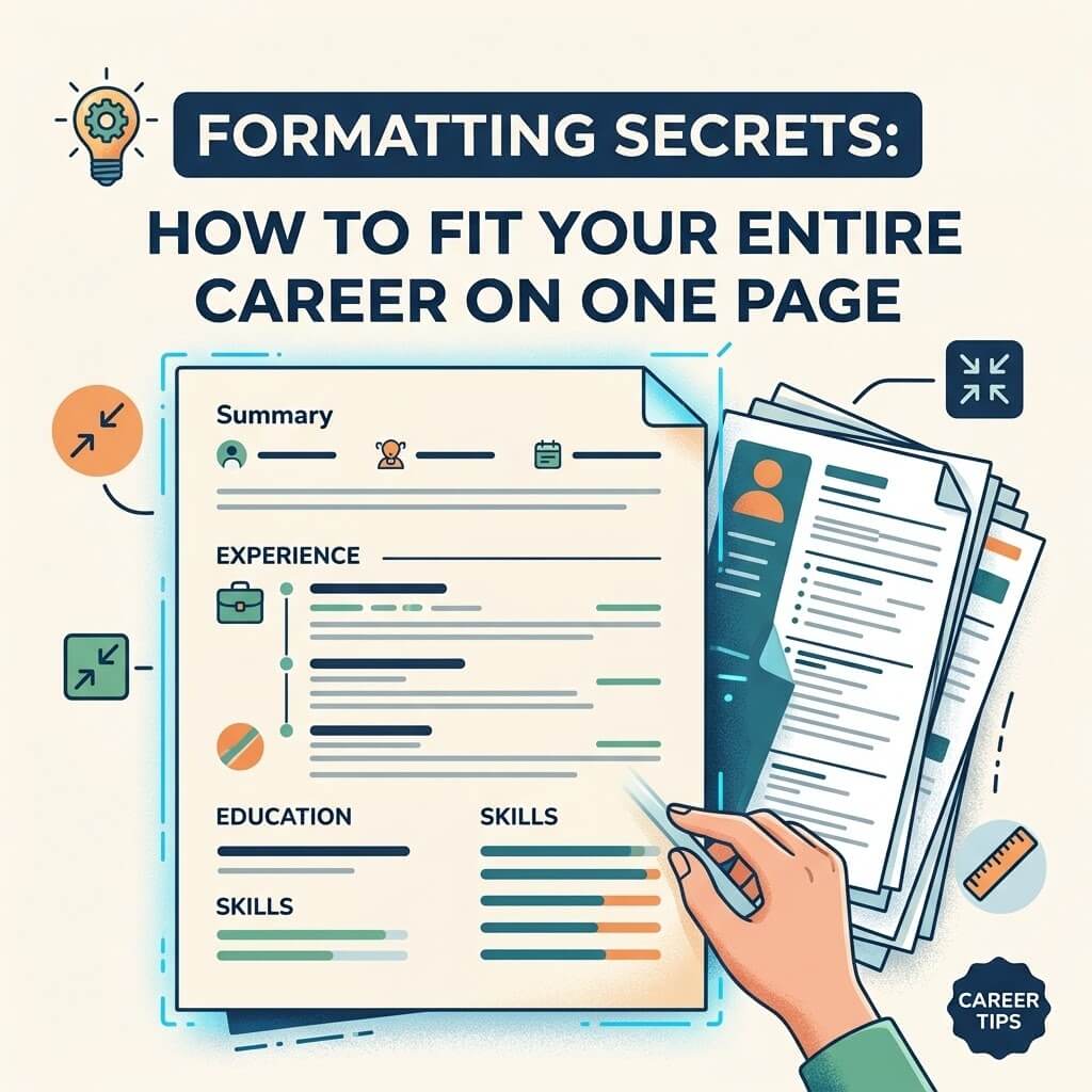
Formatting Secrets: How to Fit Your Entire Career on One Page

At some point, almost everyone with more than a few years of work history hits the same wall: a resume that’s crept to a page and a half, then two pages, and no obvious way to shrink it back down without cutting something that feels important. The instinct is to blame the content — “I just have too much experience” — but in most cases, the real problem isn’t what you’ve done. It’s how it’s formatted, worded, and prioritized on the page.

The one-page resume isn’t an arbitrary rule invented by career coaches for its own sake. It reflects how resumes actually get read: in seconds, not minutes, often on a phone or a cramped ATS preview pane, by someone scanning for relevance rather than reading for depth. A tight, well-formatted single page respects that reality. A sprawling two-pager, even a good one, often works against you — not because length is inherently bad, but because it signals that you haven’t yet figured out what matters most about your own career.

This guide covers the actual mechanics of fitting a full career onto one page: what to cut, how to compress without losing substance, and the formatting techniques that create real space without making the page look cramped or the font unreadable.

Why One Page Still Matters (Even With 10+ Years of Experience)

There’s a persistent myth that the one-page rule only applies to early-career candidates, and that anyone with a decade or more of experience is expected to spill onto a second page. In practice, most recruiters and hiring managers still prefer one page for the vast majority of roles — not because your experience isn’t valuable, but because a resume’s job isn’t to document your entire career. It’s to get you an interview. Once you’re in the room, you can go into as much depth as the conversation calls for.

The exceptions are narrower than people assume: academic CVs, some senior executive resumes, and roles in fields like law or medicine where credentialing documentation is expected to be exhaustive. For the large majority of corporate, technical, creative, and administrative roles, one page remains the functional standard, regardless of how many years you’ve worked.

The Real Reason Long Resumes Happen

Resumes rarely get long because someone deliberately decided to include everything. They get long incrementally — a bullet point added after every job change, an old role kept “just in case,” a skills section that grows every time a new tool gets learned. Nobody sits down and audits the whole document against the version of themselves they are today.

That’s the first shift in mindset: a resume isn’t a career archive, it’s a pitch document for your current target role. Anything that doesn’t support that specific pitch is a candidate for cutting, no matter how proud you are of it or how long you spent doing it.

Step One: Cut Before You Format

Formatting tricks can only do so much. If you’re trying to compress two pages of content into one purely through smaller margins and tighter line spacing, you’ll end up with a dense, unreadable wall of text that looks worse than the two-page version did. Real compression starts with editorial decisions, not visual ones.

Cut or shrink older roles. Jobs from more than 10–15 years ago rarely need more than a single line — title, company, dates — unless directly relevant to your target role. Recruiters weight recent experience far more heavily than distant experience, so give your space budget accordingly.

Remove duplicate accomplishments. If you did essentially the same thing at two different jobs, you don’t need to restate it in full both times. State it fully once, and reference it briefly the second time.

Cut the objective statement. A generic “Seeking a challenging position where I can grow my skills” line adds nothing and costs real vertical space. If you want a summary, make it two lines of specific, high-value information — not filler.

Trim bullet points to outcomes, not duties. A bullet like “Responsible for managing social media accounts and posting content” is both long and low-value. Compressed to an outcome — grew a social following by a meaningful percentage through a specific strategy — it says more in fewer words.

Drop skills that are assumed. Basic Microsoft Office proficiency, for instance, is assumed for most office roles today and rarely needs its own line. Reserve your skills section for things that genuinely differentiate you.

Step Two: Formatting Techniques That Actually Create Space

Once you’ve trimmed content, the layout itself can recover a surprising amount of room — often enough to fit one more job or a few more bullet points — without the page looking crowded.

Margins: 0.5 to 0.75 inches on all sides is generally the sweet spot. Below 0.5 inches, the page starts to look overstuffed even with good spacing elsewhere; above 1 inch, you’re wasting real usable space for no visual benefit.

Font size: 10–11pt for body text and 12–14pt for your name and section headers is a safe, readable range. Going below 10pt to force-fit content is a common mistake — it makes the resume harder to read and can actually make it look longer at a glance because of how dense the text appears.

Line spacing: Single spacing (1.0) within bullet points is standard, but a small amount of space (roughly 4–6pt) between sections and between job entries helps the eye separate them without needing extra blank lines, which waste space fast.

Section order: Put your strongest, most relevant section first — usually experience for most professionals, or a skills/summary block if you’re pivoting industries. Don’t waste prime real estate on a page-topping “References available upon request” line; it’s assumed and unnecessary.

Consistent bullet length: A visually balanced resume — where bullet points are roughly similar in length, without a few three-line monsters next to a bunch of single-line fragments — reads as more polished and often fits better, because you’re forced to trim the longest entries down to match.

Use of bold sparingly. Bold job titles or company names help scanning, but bolding entire bullet points or overusing it dilutes its effect and makes the page visually noisier, which paradoxically makes it feel longer even at the same length.

Original Framing: Think in “Space Value,” Not Just Space

Most formatting advice treats page space as a fixed resource you’re trying to shrink content into. A more useful mental model, especially for anyone struggling to cut, is to think in terms of space value — how much return each line is generating for the space it occupies.

A bullet point that states a vague duty (“managed a small team”) occupies the same vertical inch as a bullet point that states a specific, quantified outcome (“led a five-person team to complete a project two weeks ahead of schedule”). Same space cost, wildly different value delivered. Once you start evaluating every line by its space value rather than just asking “should I cut this,” the decisions get much easier. Weak, vague lines lose the comparison instantly; specific, outcome-driven lines earn their place even in a tight page.

This reframing also helps with the anxiety around cutting things. You’re not deleting your accomplishments — you’re just declining to spend expensive page space on the low-value version of them. If a role or achievement genuinely matters, it deserves to be rewritten with more specificity, not necessarily more room.

A Section-by-Section Space Budget

For a typical one-page resume, a reasonable space allocation looks roughly like this:

  • Header (name, contact info): 3–5% of the page — one compact line, not a full block with icons and dividers eating space.
  • Summary (optional): 5–8% — two tight lines maximum, only if it adds real information.
  • Experience: 55–65% — this is the core of the resume and should get the majority of the space, weighted toward your most recent and most relevant roles.
  • Education: 8–12% — more if you’re early-career and education is your strongest asset, less if you have significant work history.
  • Skills: 8–12% — a focused, relevant list, not an exhaustive inventory of every tool you’ve ever touched.

This isn’t a rigid formula, but having a rough budget in mind prevents the common failure mode where someone spends 20% of their page on education from a decade ago while cramming their most recent, most relevant role into three cramped bullet points.

What NOT to Do to Save Space

Some space-saving tricks do more harm than good, particularly around ATS compatibility (a separate but related concern to visual formatting):

  • Don’t shrink margins below 0.4 inches — many templates and printers will clip content, and it looks visibly cramped.
  • Don’t use a font below 9pt anywhere on the page — it damages readability more than it’s worth.
  • Don’t compress line spacing to the point where bullet points visually merge — this makes scanning harder, defeating the purpose of a concise resume.
  • Don’t switch to a condensed or narrow font purely to fit more characters per line — these are often harder to read quickly and can look like an obvious formatting hack.
  • Don’t remove white space entirely — a resume with zero breathing room between sections reads as dense and effortful in a bad way, even if every individual line is valuable.

When It’s Actually Okay to Go to a Second Page

There are legitimate cases where forcing a genuinely dense, high-value career onto one page does more harm than good — usually senior-level candidates with 15+ years of distinct, relevant experience across multiple significant roles, where trimming further would mean cutting real substance rather than filler. In that situation, a clean two-page resume that’s well-organized beats a cramped one-pager with 8pt font and no white space.

The test worth applying: if you’re cutting adjectives, filler phrases, and low-value duties and you’re still overflowing, a second page may be justified. If you’re cutting genuine accomplishments and specific, quantified achievements just to hit one page, you’ve gone too far in the other direction — the page limit is a guideline in service of clarity, not a rule that should cost you your strongest material.

Key Takeaways

  • One page remains the standard for most professionals, even those with a decade or more of experience — its job is to earn an interview, not document a full career.
  • Real compression starts with editorial cuts (older roles, duplicate points, filler phrases) before any formatting adjustment.
  • Margins of 0.5–0.75 inches and fonts of 10–11pt for body text keep a resume both compact and readable.
  • Evaluate each line by its “space value” — how much it earns relative to the vertical space it costs — rather than treating all content as equally worth keeping.
  • Budget your page roughly by section, weighting the majority of space toward recent, relevant experience.

A second page is occasionally justified for senior candidates, but only after genuine editorial trimming — not as a shortcut around doing the harder compression work.

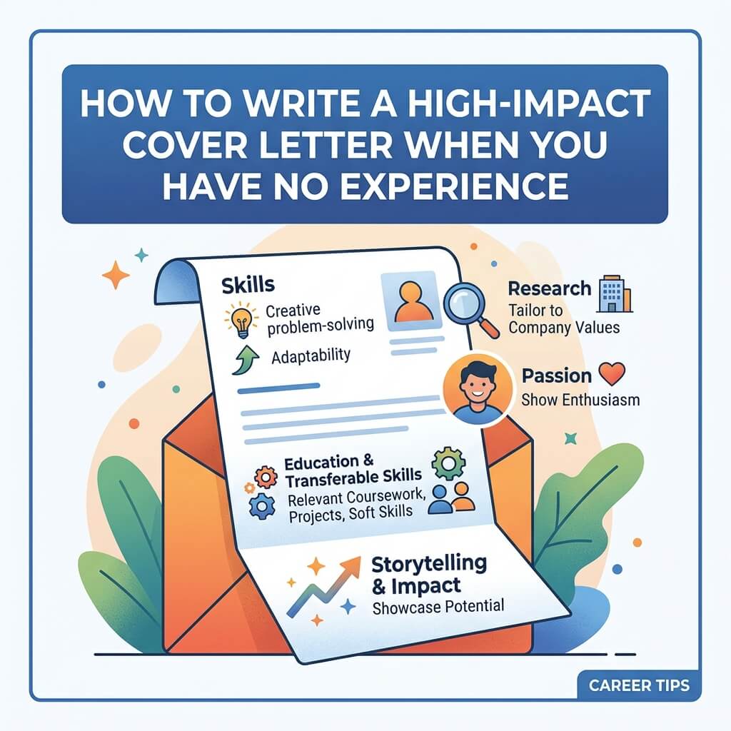
How to Write a High-Impact Cover Letter When You Have No Experience

There’s a particular kind of dread that comes with staring at a blank cover letter template when you have no professional experience to point to. Every guide seems to assume you’ve already got three years in the industry, a list of quantified achievements, and a former manager ready to vouch for you. But what if you’re a recent graduate, a career switcher, or someone re-entering the workforce after a long gap? The advice to “highlight your accomplishments” can feel like it’s written for someone else entirely.

Here’s the reassurance worth starting with: hiring managers read plenty of “no experience” cover letters, and they don’t expect a resume of accomplishments from every applicant. What they’re actually evaluating is whether you can think clearly, communicate well, and demonstrate that you’d put in real effort if hired. A cover letter is one of the few places in the entire application process where you get to control the narrative instead of just listing facts — and that’s an advantage, not a disadvantage, when your work history is thin.

This guide breaks down exactly how to build a compelling cover letter from the ground up, without inflating your background or relying on vague enthusiasm as a substitute for substance.

Why “No Experience” Doesn’t Mean “Nothing to Say”

The mistake most inexperienced applicants make isn’t a lack of effort — it’s a narrow definition of what counts as relevant. If you’re thinking only in terms of paid, full-time jobs in your target field, you probably do have very little to draw on. But that’s the wrong lens.

Relevant material for a cover letter can come from:

  • Coursework, capstone projects, or a thesis that required the same skills the job demands
  • Part-time jobs, even unrelated ones (retail, food service, tutoring) that demonstrate reliability, communication, or problem-solving
  • Volunteer work, student organizations, or leadership roles in clubs
  • Freelance or self-directed projects — a website you built, a small business you tried, a blog you maintained
  • Group projects where you took on responsibility or resolved a conflict
  • Certifications, online courses, or self-teaching that shows initiative

The goal isn’t to pretend these experiences are equivalent to a professional career. It’s to extract the underlying skill — communication, ownership, problem-solving, consistency — and show that you’ve already practiced it somewhere, even if the setting wasn’t a corporate office.

Start With the Job Description, Not With Yourself

A common structural error is writing a cover letter that’s entirely about “here’s who I am,” disconnected from what the employer actually needs. Before you write a single sentence, read the job posting twice and pull out the three or four requirements that show up most clearly — not just skills, but qualities (“works well under pressure,” “detail-oriented,” “comfortable with ambiguity”).

Once you know what they’re asking for, your job becomes much simpler: find one real example from your life, however small, that demonstrates each quality. This reframes the whole letter from “convince them I’m impressive in general” to “show them I match what they specifically need.” That shift alone tends to produce sharper, more focused writing than generic enthusiasm ever will.

The Structure That Actually Works

A cover letter for someone without direct experience benefits from a slightly different structure than a traditional one, because you can’t lean on a chronological list of jobs. Here’s a framework that holds up well:

1. Opening: A Specific, Non-Generic Hook

Skip “I am writing to apply for the position of X, which I saw on your website.” Every recruiter has read that sentence a thousand times, and it wastes your strongest real estate — the first two lines, which determine whether the rest gets read carefully or skimmed.

Instead, open with something specific: a genuine observation about the company, a brief personal connection to the field, or a concrete detail about why this particular role interests you. Specificity signals that you actually researched the company rather than mass-applying — which matters more when you don’t have a strong resume doing the convincing for you.

2. Middle Paragraph One: Bridge Your Background to Their Needs

This is where you connect a real experience — coursework, a part-time job, a project — to one of the core requirements from the posting. Be concrete. Instead of “I have strong communication skills,” describe a specific situation: coordinating a group project with conflicting schedules, explaining a technical concept to a non-technical audience, or handling a difficult customer interaction. Specificity is what separates a believable claim from a generic one.

3. Middle Paragraph Two: Show You Understand the Role, Not Just the Company

Many “no experience” cover letters focus entirely on why the applicant wants the job, without showing any understanding of what the job actually involves day to day. Spend a few sentences demonstrating that you understand the core function of the role — what problems it solves, what a normal week might look like — and connect that understanding to your own motivation or preparation. This does double duty: it proves genuine interest and subtly reassures the reader that you won’t be surprised or disengaged once hired.

4. Closing: Confidence Without Overcompensating

Avoid two common closing mistakes: apologizing for your lack of experience (“Although I don’t have much experience…”) and overcompensating with inflated confidence that doesn’t match your background. Instead, close with a grounded statement of what you bring and a clear, low-pressure call to action — expressing interest in discussing the role further, rather than presuming the interview is guaranteed.

Original Framing: Treat the Cover Letter as a Work Sample

One angle that’s underused in most advice on this topic: a cover letter is itself a small sample of your work product. If the role involves any writing, communication, client interaction, or attention to detail — which most entry-level roles do — your letter isn’t just describing your qualifications, it’s demonstrating them in real time. A clean, well-organized, error-free letter with a clear structure is, in a very literal sense, evidence that you can produce clean, well-organized, error-free work.

This reframing changes how you should edit. Don’t just check for typos — check whether the letter itself models the qualities you’re claiming to have. If you’re applying for a role that values clarity, is every sentence clear? If it values conciseness, is the letter unnecessarily long? If it values enthusiasm and initiative, does the writing itself sound engaged, or does it read like it was copied from a template with your name swapped in? Employers pick up on this consistency (or lack of it) more than most applicants realize.

Common Mistakes That Undercut an Inexperienced Applicant’s Letter

Leading with an apology. Phrases like “Even though I don’t have professional experience…” plant doubt in the reader’s mind before you’ve given them a reason to think otherwise. Let your examples do that work instead.

Restating the resume. If your cover letter is just your resume in paragraph form, it adds no value. The letter should add context, reasoning, and personality that a bulleted resume can’t.

Overusing adjectives instead of evidence. Words like “passionate,” “hardworking,” and “driven” are meaningless without a specific example attached. One concrete anecdote beats five adjectives.

Writing for every job at once. A letter vague enough to apply to any position at any company usually reads as exactly that — generic, and easy to skim past.

Ending on uncertainty. Closing lines like “I hope you’ll consider me despite my lack of experience” undercut everything that came before it. End on what you bring, not what you’re missing.

A Worked Example: Turning a “Nothing” Experience Into Something Usable

Say you’re applying for an entry-level marketing coordinator role, and the only relevant thing you can think of is that you ran your college’s social media account for a student organization. That might not feel like “real” experience — but look at what it can actually demonstrate:

  • You planned and scheduled content (organization, planning)
  • You likely tracked engagement or growth in some form (basic analytics awareness)
  • You had to adapt tone or content based on what did or didn’t perform well (data-informed decision-making)
  • You probably coordinated with other members or leadership on messaging (collaboration)

Written generically, this becomes: “I have some social media experience.” Written with specificity, it becomes a genuine example: describing how you grew engagement for a small organization’s account by testing different content formats and adjusting based on what resonated — a small-scale version of exactly what a marketing coordinator role would ask of you. The underlying skills are the same as what a professional would list; the only difference is scale.

This is the core technique for the entire letter: don’t downplay small-scale experience because it wasn’t a paid job. Describe it with the same specificity and outcome-focus you’d use for a “real” one.

What to Do If You Genuinely Have Almost Nothing to Draw On

If you’re struggling to find even small examples — no clubs, no part-time work, no relevant coursework — the honest move is to lean into transferable qualities from wherever your time has actually gone. Caring for a family member, working through school, teaching yourself a skill from scratch, or managing a difficult personal circumstance while staying on track all demonstrate real capabilities like discipline, time management, and resilience. You don’t need to overshare personal details, but a brief, honest acknowledgment of your actual circumstances, paired with what you learned or how you grew from it, often lands better than a strained attempt to manufacture professional-sounding experience that isn’t there.

Length, Tone, and Formatting

Keep the letter to three or four paragraphs and under one page — roughly 250 to 400 words. Longer letters tend to dilute the strongest points rather than strengthen them, especially when you’re working with limited material. Match the tone to the company: a startup or creative agency generally tolerates more personality and informality than a law firm or financial institution, so calibrate accordingly rather than defaulting to either extreme.

Format it like a real letter: a proper greeting (use a name if you can find one, rather than “To Whom It May Concern”), clear paragraph breaks, and a professional sign-off. These small details matter more than usual when you don’t have a strong resume to fall back on if the letter looks careless.

Key Takeaways

  • Lack of paid experience doesn’t mean lack of relevant material — coursework, volunteer work, part-time jobs, and personal projects all count if framed with specificity.
  • Build the letter around the job posting’s actual requirements, not a generic account of your background.
  • Use one concrete example per key requirement rather than vague adjectives like “hardworking” or “passionate.”
  • Treat the letter itself as a work sample: its clarity and structure are evidence of the skills you’re claiming to have.
  • Avoid apologizing for your experience level — let the specificity of your examples do the persuading instead.
  • Keep it under a page, tailored to the specific role, and free of the generic phrasing recruiters skim past.

Text vs. PDF Resumes: Which Format Should You Actually Use?

If you’ve spent any time job hunting recently, you’ve probably run into this debate somewhere in a forum thread, a career coach’s LinkedIn post, or a recruiter’s offhand comment: should your resume be a plain text file, or a polished PDF? It sounds like a small technical question, but it actually sits at the intersection of two very different systems — the software that screens your resume before a human ever sees it, and the human who eventually does. Get the format wrong, and you can lose out on an interview before your qualifications are even considered.

This isn’t a matter of personal taste. Text and PDF resumes behave differently inside applicant tracking systems (ATS), render differently across devices, and send different signals to hiring managers. Below, we’ll break down exactly how each format performs, when to use which, and how to hedge your bets so a formatting mistake never costs you a job.

Why This Debate Even Exists

Twenty years ago, this wasn’t much of a question. You wrote a resume, saved it as a Word document, and emailed it or printed it. PDFs existed, but they weren’t the default expectation, and ATS software was primitive or nonexistent for most companies below the Fortune 500.

Today, an estimated 75–99% of large and mid-sized employers use some form of applicant tracking system to filter resumes before a recruiter ever opens one. These systems parse your resume, extract text, match it against keywords from the job description, and often rank or filter candidates automatically. That single shift — from “a human reads this” to “software reads this first” — is the entire reason the text-vs-PDF conversation exists at all. A format that looks great to a human can look like garbage to a parser, and vice versa.

What “Text Resume” Actually Means

When people say “text resume,” they usually mean one of two things, and it’s worth separating them because they behave very differently:

  1. A .txt file — literally plain text, no formatting, no bold, no bullet points beyond dashes or asterisks. This is the most stripped-down version, often used when pasting directly into an online application form’s text box.
  2. A “plain text formatted” resume saved as .docx or .pdf — a resume that avoids complex formatting (tables, text boxes, columns, graphics) but is still saved in a standard document format. This is what most career advisors actually mean when they say “keep it simple for the ATS.”

The second interpretation matters more in practice, because almost no employer wants a literal .txt file as an attachment — it looks unprofessional and strips out even basic readability. What they’re really asking for is a resume that is structured simply even if it’s saved as a PDF or Word file.

What Makes PDFs Attractive

PDFs became the default resume format for a good reason: they preserve exactly what you designed. Fonts, spacing, alignment, and layout look identical whether the file is opened on a Mac, a Windows PC, or a phone. For a document meant to represent your professionalism, that consistency matters. A resume that shifts fonts or collapses a two-column layout into a jumbled mess on a recruiter’s screen makes a bad first impression regardless of how strong your experience is.

PDFs also can’t be easily edited by someone else, which some candidates find reassuring — no accidental changes, no version drift between what you sent and what the employer opens.

Where PDFs Can Backfire

Here’s the part most job seekers don’t find out until it’s too late: not all PDFs are created equal from a parsing standpoint, and older or poorly configured ATS software can genuinely mangle them.

The failure modes tend to cluster around a few specific design choices:

  • Multi-column layouts. Many parsers read left to right, top to bottom, in a single pass. A two-column resume can get scrambled — your job title from the left column merges with a bullet point from the right column, producing nonsense.
  • Text boxes and graphics. Text placed inside a text box, icon, or image (like a “skills” section styled as an infographic) is sometimes invisible to a parser entirely. If your contact info sits inside a designed header graphic, some systems fail to extract it at all.
  • Tables. Similar issue — table cells can be read out of order or dropped.
  • Non-standard fonts or embedded images of text. If a PDF was generated by “printing” a designed image rather than exporting real selectable text, it may not be parsable at all.
  • Older ATS engines. Some legacy systems, particularly at companies that haven’t updated their hiring software in years, handle PDFs worse than newer platforms like Workday, Greenhouse, or Lever, which have generally improved PDF parsing significantly.

None of this means PDFs are unsafe by default. A clean, single-column PDF built with standard fonts and no embedded graphics parses just as well as a plain document in the vast majority of modern systems. The danger comes specifically from design-heavy PDFs — the kind built to look impressive in a portfolio sense rather than to survive machine reading.

Where Plain-Text-Style Resumes Win

A resume built with simple, linear formatting — single column, standard section headers (Experience, Education, Skills), no tables or graphics — is close to bulletproof for ATS parsing regardless of whether you save it as .docx or PDF. There’s simply less for the software to misinterpret.

This is also why some job boards and company portals explicitly ask you to copy-paste your resume into a text box rather than upload a file. In that scenario, only the actual text matters; formatting is irrelevant because the system strips it anyway. If you paste a resume that was designed with visual formatting in mind, you’ll often see broken line breaks, merged words, or missing bullet points in the text box — a strong sign that the same resume, submitted as a file, could confuse a parser too.

The Human Factor: What Recruiters Actually Prefer

It’s worth separating the ATS question from the human-reader question, because they don’t always point the same direction.

Once a resume clears the automated screen, a recruiter or hiring manager is going to open it — and at that stage, a well-designed PDF generally reads better than a bare-bones document. Subtle use of bold, spacing, and a clean single-column layout helps a human scan your experience quickly, which matters when a recruiter is spending an average of six to eight seconds on an initial resume glance. A resume that looks like an unformatted wall of text can come across as low-effort, even if the content is strong.

There’s also the print/attachment factor. If a hiring manager forwards your resume internally, prints it for an interview panel, or opens it on a phone, a PDF guarantees it looks the same everywhere. A Word document might reflow oddly depending on the software version opening it; a plain text file has essentially no visual structure to lose or preserve.

So the honest answer is that PDFs still win for human-facing polish — the risk isn’t the format itself, it’s overdesigning the format.

So Which Should You Actually Use?

Here’s the practical framework, rather than a flat rule:

Use a PDF when:

  • You’re uploading directly to a job posting as a file attachment.
  • The application explicitly allows PDF (most do).
  • Your resume uses simple, single-column formatting with standard fonts (Calibri, Arial, Georgia, etc.), no tables, and no text boxes.
  • You want to guarantee visual consistency for human reviewers.

Use plain text (or paste as plain text) when:

  • The application has a “copy and paste your resume” text box instead of a file upload.
  • You’re applying through an older company career portal that explicitly warns about PDF compatibility issues.
  • You’re emailing your resume directly in the body of an email as a backup to an attachment.

Avoid entirely, regardless of format:

  • Multi-column “modern” templates from design-first resume builders, unless you’ve tested how they parse.
  • Resumes where your name, email, or phone number are part of a graphic header rather than real text.
  • Skill “graphics” like bar charts or star ratings representing proficiency — these are unreadable to both parsers and many humans.

A Simple Way to Test Your Resume Before You Apply

You don’t have to guess. A quick, practical test: open your PDF resume, select all the text (Ctrl+A or Cmd+A), copy it, and paste it into a blank text document or a plain email. If everything comes out in the correct order — your name, then contact info, then your most recent job with its bullet points, in the order you intended — your formatting is parser-friendly. If sections merge, bullet points disappear, or your contact information ends up in a strange location in the pasted text, your layout needs simplifying before you submit it anywhere with an unknown ATS.

This five-minute test catches the majority of formatting issues that would otherwise silently filter you out of consideration, and it works regardless of which resume builder or word processor you used to create the file.

Should You Submit Both Formats?

In situations where you’re not limited to a single upload — for example, when emailing a hiring manager directly or submitting through a portal that allows multiple attachments — there’s a reasonable case for keeping a plain, ATS-safe version on hand alongside your polished PDF, and sending whichever fits the application’s instructions. This isn’t necessary for every application, but it’s a useful habit if you’re applying to a mix of large corporate employers (more likely to run older ATS software) and smaller companies or direct outreach (where a well-designed PDF will make a stronger visual impression).

What you shouldn’t do is submit two different resumes to the same posting hoping one gets through — most systems will flag duplicate applications, and it can look disorganized.

The Bigger Picture: Format Is a Filter, Not a Substitute

It’s easy to get so focused on the text-vs-PDF question that you lose sight of the obvious truth: format determines whether your resume gets read, not whether it gets you hired. A perfectly parsable resume with weak, generic bullet points will still lose to a slightly riskier PDF with strong, quantified achievements — assuming it clears the ATS at all. Spend real time on the content itself: specific numbers, clear outcomes, and language that mirrors the actual job posting’s keywords, since most ATS platforms are doing keyword matching regardless of file format.

Think of formatting as a gate you need to pass through, not a strategy that wins the job on its own. Get the gate right — simple, clean structure, tested for parsing — and then put your real effort into making the content on the other side of that gate impossible to ignore.

Key Takeaways

  • Most mid-size and large employers use ATS software to screen resumes before a human sees them, which is why format matters at all.
  • PDFs are generally safe for modern ATS platforms, but only when built with simple, single-column layouts and no embedded graphics or tables.
  • “Plain text” resumes matter most when an application specifically asks you to paste your resume into a text box rather than upload a file.
  • Human recruiters still prefer the visual polish of a well-formatted PDF once your resume clears automated screening.
  • Test your resume by copying and pasting its text into a blank document — if it comes out clean and in order, it will likely parse correctly.
  • Formatting only gets your resume read. Strong, specific content is what gets you the interview.

How to Explain Employment Gaps on Your Resume (With Examples)

How to Explain Employment Gaps on Your Resume (With Examples)

There’s a particular kind of dread that sets in when you’re staring at your own work history and realize there’s a hole in it. Six months between jobs. A year spent caregiving. Eighteen months that vanished into a layoff and a slow job market. The instinct is almost always the same: hide it, shrink it, hope nobody notices.

That instinct is understandable, and it’s also outdated. Employment gaps have become so common — thanks to layoffs, the pandemic, caregiving responsibilities, health issues, and the general instability of modern careers — that most experienced recruiters no longer treat a gap itself as a red flag. What raises eyebrows isn’t the gap. It’s the silence around it. An unexplained gap invites the reader to imagine the worst-case explanation, and imagination is rarely kind. This guide walks through how to close that gap in the reader’s mind before it becomes a problem, with real language you can adapt.

Why Gaps Feel Bigger Than They Actually Are

Here’s something worth sitting with: the person most bothered by your employment gap is almost always you, not the hiring manager. Candidates tend to assume recruiters are running a magnifying glass over every month of their timeline, hunting for inconsistencies. In reality, most recruiters are skimming quickly, pattern-matching for red flags, and moving on. A gap that’s acknowledged briefly and confidently barely registers. A gap that’s obviously being hidden — through vague date formatting or suspicious omissions — registers immediately, because concealment reads as far more suspicious than the gap itself would have.

This is the core principle behind everything in this guide: you’re not trying to make the gap disappear. You’re trying to make it boring. Boring is the goal. A gap that reads as an ordinary, explainable life event doesn’t cost you the interview. A gap that reads as a mystery does.

The Most Common Employment Gap Mistakes

1. Using deceptive date formatting. Listing only years instead of months (“2023–2024” to obscure a ten-month gap) is a well-known trick, and experienced recruiters know it too. It doesn’t hide anything; it just signals that you’re hoping they won’t do the math. If your gap is going to come up in conversation anyway, better to control the narrative on your own terms than have it feel like something was caught.

2. Over-explaining in the resume itself. The opposite mistake is writing a paragraph of justification directly on the resume — health details, family circumstances, financial hardship. This is oversharing in a document designed for scanning, not storytelling, and it can also open the door to certain forms of unconscious bias you have no obligation to invite in. The resume’s job is to briefly signal that the gap is accounted for; the interview is where more nuanced conversation, if needed, happens.

3. Treating every gap the same way. A three-month gap after a layoff needs almost no explanation at all — it’s simply normal. An eighteen-month gap for a career pivot benefits from framing that connects what you were doing during that time to where you’re headed next. Not all gaps carry equal narrative weight, and treating a minor gap like it needs a dramatic cover story often draws more attention to it than it deserves.

4. Leaving productive time invisible. This is the most fixable mistake on the list. Many people spend gap periods doing things that are entirely resume-relevant — freelance work, coursework, volunteering, caregiving that developed real organizational skills — but never think to mention any of it because it wasn’t a “real job.” If you did something during the gap, even informally, it usually belongs somewhere on the page.

Five Strategies for Handling a Gap, With Examples

Strategy 1: Use a Functional or Combination Resume Format

Traditional chronological resumes put dates front and center, which can make gaps more visually obvious. A combination format leads with a skills or qualifications summary and pushes the detailed timeline further down, giving the reader a strong impression of your abilities before they hit the dates. This doesn’t hide anything — it just changes what gets read first.

Strategy 2: Add a Line Item for the Gap Period

Treat the gap period the way you’d treat any other line on your resume: give it a title, a date range, and one or two lines of description.

Example — Caregiving:

Family Caregiver | March 2023 – January 2024 Managed full-time care coordination for a family member, including medical scheduling, insurance navigation, and household budget management.

Example — Layoff/Job Search:

Independent Consultant | June 2023 – October 2024 Provided freelance marketing consulting for two small businesses while conducting a targeted job search in the SaaS industry.

Example — Education/Upskilling:

Professional Development | January 2023 – August 2023 Completed a full-stack web development certification (400+ hours) and built three portfolio projects using React and Node.js.

Each of these treats the gap as a period of activity rather than absence — because in most cases, it genuinely was one.

Strategy 3: Address It Briefly in the Cover Letter

For candidates who feel their gap needs slightly more context than a resume line can offer, a single sentence in the cover letter often does the job better than any resume formatting trick. The key word is briefly.

Example: “After a company-wide layoff in early 2023, I spent several months caring for a family member before returning to a focused job search — during which I also completed a certification in project management to sharpen my skills for this next chapter.”

Notice the structure: state the fact plainly, don’t apologize for it, and pivot quickly toward forward motion. A sentence like this closes the loop without inviting further scrutiny.

Strategy 4: Reframe Around What the Gap Produced

This is the strategy most candidates underuse, and it’s arguably the most persuasive one available. Rather than treating the gap as something to explain away, treat it as a period that produced something useful — a skill, a perspective, a piece of evidence about how you handle adversity.

Someone who spent a year unemployed after a layoff and used part of that time to learn a new software platform isn’t just “explaining a gap” when they mention it — they’re demonstrating initiative under pressure, which is a genuinely attractive trait to employers. The gap stops being a liability and becomes, in a small way, evidence in your favor.

Strategy 5: Prepare a Short, Confident Verbal Explanation

Even a resume that handles a gap gracefully will often still generate a follow-up question in an interview. The candidates who handle this best aren’t the ones with the most dramatic or sympathetic story — they’re the ones with the calmest, most rehearsed thirty-second answer. A good template:

What happened → what you did with the time → why you’re ready now.

“I was laid off along with about 40% of my team when the company restructured. I used the time to complete a certification and take on some freelance projects, and I’m honestly glad to be bringing that updated skill set into a full-time role now.” Said with a steady tone, this kind of answer usually closes the topic within seconds. Nervous over-explanation is what keeps it open.

Gap Explanations by Situation

Layoff or company downsizing: This is the easiest gap to explain, because it’s almost universally understood and carries no stigma in most industries. A brief, factual mention is enough — no need to dress it up.

Health-related gap: You are never obligated to disclose specific medical information on a resume or in an interview. A general phrase like “medical leave” or “personal health matter” is sufficient, and any employer asking for more than that in an interview is asking for more than they’re entitled to.

Caregiving (children, aging parents, family illness): Framing caregiving explicitly as unpaid labor with transferable skills — coordination, budgeting, crisis management — tends to land well, because it treats the work as work rather than as an absence from work.

Travel or sabbatical: These gaps benefit from a light touch. One line acknowledging the time away, optionally with a brief nod to any skills or perspective gained, is usually all that’s needed.

Failed business or entrepreneurial attempt: This is one of the more nuanced gaps to explain, because “my business didn’t work out” can sound discouraging if framed poorly. Reframing around what was built, learned, or managed — budgets, hiring, sales, negotiation — usually serves better than framing around the outcome.

Extended job search in a difficult market: Naming this plainly (“job search,” “career transition”) is often more credible than trying to disguise the time with vague freelance titles that don’t hold up to a follow-up question.

A Final Note on Perspective

It’s worth remembering that the modern labor market has made gaps dramatically more common than they were even a decade ago. Mass layoffs across entire industries, the aftershocks of a global pandemic, and a general loosening of the idea that a career must be one unbroken chronological line have all shifted what “normal” looks like on a resume. Hiring managers who’ve been through their own version of a gap — and by now, many have — tend to extend more grace than candidates expect. The goal of every strategy in this guide isn’t to trick anyone into overlooking a gap. It’s to present it the way it actually happened: as a period of your life that, like every other period on your resume, had things happening in it. Handled with a little structure and a calm tone, a gap stops being the thing a hiring manager notices first — and becomes just one more unremarkable line in a resume that’s otherwise doing its job.

The Ultimate Guide to Writing a Career Objective That Gets Read

The Ultimate Guide to Writing a Career Objective That Gets Read

Recruiters spend an average of six to eight seconds scanning a resume before deciding whether to keep reading. That statistic alone should change how you think about the career objective sitting at the top of your document. It isn’t a formality. It’s the headline of your personal marketing pitch, and like any headline, it either earns the reader’s attention or loses it.

Most career objectives fail for the same reason clickbait headlines fail: they promise nothing specific. “Seeking a challenging position where I can utilize my skills and grow professionally” tells a hiring manager absolutely nothing about who you are or what you bring to their team. It’s the resume equivalent of white noise. This guide breaks down why that happens, what actually works instead, and how to write an objective statement that survives the six-second test — and earns you the next thirty.

Why the Career Objective Still Matters in 2026

There’s a persistent myth in career advice circles that the “objective statement” is dead, replaced entirely by the more modern “resume summary.” There’s some truth buried in that claim, but it’s more nuanced than a flat yes or no.

The distinction matters less than people think. What actually killed the old-style objective wasn’t the label — it was the content. Statements that talked about what the candidate wanted (“seeking a role that offers growth and stability”) gave way to statements that talked about what the candidate offers (“results-driven marketing coordinator with 3 years of experience scaling paid social campaigns”). That shift in orientation, from taker to giver, is the real evolution. Whether you call the resulting few sentences an “objective” or a “summary” is almost beside the point — the underlying skill is the same, and it’s the one this guide focuses on.

Career objectives remain especially useful in a few specific situations:

  • Entry-level candidates with little work history to summarize
  • Career changers who need to explain a pivot before the reader gets confused
  • Applicants targeting a very specific role where a tailored, focused statement helps beat automated screening
  • Anyone applying through an Applicant Tracking System (ATS), where the right keywords in the opening lines can influence whether a human ever sees the resume at all

If you fall into any of these categories, a well-written objective isn’t optional — it’s doing real work that the rest of your resume can’t do on its own.

The Anatomy of an Objective That Actually Gets Read

A strong career objective almost always contains four ingredients, in roughly this order:

  1. A role or professional identity — who you are, stated in industry-recognizable terms
  2. A quantifiable strength or credential — proof, not adjectives
  3. A specific value proposition — what problem you solve for this particular employer
  4. A subtle signal of intent — what you’re aiming for next, phrased around their needs rather than yours

Compare these two examples:

Weak: “Hardworking and motivated individual looking for an opportunity in customer service where I can use my communication skills.”

Strong: “Customer service representative with 2+ years of experience resolving an average of 60+ tickets per day at a 95% satisfaction rate, seeking to bring proven de-escalation and CRM expertise to [Company]’s support team.”

The second version isn’t longer because it’s trying to impress with length — it’s longer because it’s carrying more evidence per sentence. Every word is either a credential, a number, or a specific skill. Nothing is filler.

Common Mistakes That Sink an Objective Statement

1. Vague self-praise instead of evidence. Words like “dynamic,” “passionate,” “hardworking,” and “detail-oriented” have been used so often in resumes that they’ve essentially become noise to a trained reader. A recruiter has no way to verify “passionate.” They can verify “increased regional sales by 18% over two quarters.”

2. Writing about what you want, not what you offer. This is the single most common flaw in objective statements, and it’s worth dwelling on because it’s so counterintuitive to fix. Job seekers naturally think about their own needs first — that’s human. But an employer reading a stack of resumes isn’t hiring a charity case; they’re solving a problem. Every sentence in your objective should implicitly answer the question: “Why should this specific company care?”

3. Making it generic enough to apply to any job. If you could copy-paste your objective statement into an application for a completely different role at a different company and it would still technically make sense, it’s too generic to be useful. Specificity is what makes an objective feel like it was written for this employer rather than mass-produced.

4. Ignoring the ATS. Many companies filter resumes through software before a human ever sees them. That software is often scanning for specific keywords pulled directly from the job description — job titles, tools, certifications, methodologies. An objective statement that never mentions any of these terms risks being filtered out regardless of how well-written it is. This doesn’t mean stuffing keywords unnaturally; it means mirroring the language the employer already used to describe the role.

5. Excessive length. A career objective is not a cover letter. Two to four sentences, or roughly 30–50 words, is the sweet spot. Anything longer starts competing with the rest of the resume for attention it hasn’t earned yet.

How to Write Your Career Objective, Step by Step

Step 1: Study the job posting like a script

Before writing a single word, read the job description twice — once for overall sense, once specifically hunting for repeated terms, required tools, and phrases that signal what the employer values most. If “cross-functional collaboration” appears twice in a posting, that’s not an accident; it’s a hint about what the hiring manager is worried about finding in a candidate.

Step 2: Identify your strongest, most relevant proof point

Pick one achievement, credential, or skill set that most directly answers the employer’s stated need. Resist the urge to list everything you’ve ever done — an objective is a highlight reel, not a full biography.

Step 3: Draft using the four-part structure

Role + Proof + Value + Direction. Write it out in full sentences first, then edit ruthlessly. A useful trick: after drafting, delete every adjective and see if the sentence still makes sense. If it does, the adjective wasn’t doing any work.

Step 4: Mirror the employer’s language — without copying it verbatim

If the posting says “manage stakeholder relationships,” and your resume elsewhere says “client communication,” consider aligning the phrasing. This isn’t about gaming a system dishonestly; it’s about speaking the same professional dialect as the person reading your resume, human or algorithmic.

Step 5: Read it out loud

This sounds trivial, but it catches more problems than any other editing step. If a sentence is hard to say naturally, it’s probably packed with too much jargon or too many clauses. Objective statements should read like confident, plain speech — not like a corporate press release.

Real Examples Across Different Career Stages

Recent graduate: “Recent Computer Science graduate (GPA 3.8) with hands-on experience building three full-stack applications during coursework and a summer internship at a fintech startup, seeking a junior developer role where I can apply Python and React skills to real-world product problems.”

Mid-career professional: “Operations manager with 6 years of experience streamlining supply chain workflows, reducing fulfillment time by 22% at a 200-person distribution company, looking to bring process optimization expertise to a growth-stage logistics team.”

Career changer: “Former high school teacher transitioning into instructional design, bringing 5 years of curriculum development experience and a recent certification in UX for e-learning, aiming to help [Company] build more engaging corporate training content.”

Returning to the workforce: “Marketing professional returning to full-time work after a career break, with prior experience managing $500K+ in annual ad spend and a recently completed certification in Google Analytics 4, ready to bring updated digital marketing skills to a fast-paced in-house team.”

Notice that none of these rely on generic enthusiasm. Each one leads with a credential or number, and each one gestures toward a specific kind of employer need.

A Word on Tone

There’s a temptation, especially among newer job seekers, to sound impressive by sounding formal — reaching for words like “utilize” instead of “use,” or “leverage” instead of “apply.” In small doses this is fine, but overdone, it creates distance instead of confidence. The best objective statements read like a capable person describing their own work plainly, not like a thesaurus exercise. Confidence, in resume writing, usually sounds simple.

Final Checklist Before You Hit Submit

  • Does it mention a specific role, not a vague “position”?
  • Does it include at least one number, credential, or concrete skill?
  • Could this sentence only apply to this job, or could it be pasted into any application?
  • Have I mirrored language from the actual job posting?
  • Is it under 50 words?
  • Does it sound like something a confident professional would say out loud?

If you can answer yes to all six, your career objective isn’t just filling space at the top of the page — it’s doing the job it was always meant to do: making a stranger want to keep reading.

How to Tailor Your CV for ATS (Applicant Tracking Systems)

How to Tailor Your CV for ATS (Applicant Tracking Systems)

You spent three hours perfecting your CV. The formatting is clean, the language is polished, and your experience genuinely matches the job. You hit submit — and never hear back.

What happened?

Chances are, a machine screened you out before a human ever read your name.

Applicant Tracking Systems (ATS) have fundamentally changed how hiring works. Understanding how they function — and how to work with them, not against them — is no longer optional. It is the difference between getting interviews and getting ignored.


What Is an ATS and Why Does It Matter?

An ATS is software that employers use to collect, filter, and rank job applications. When you submit a CV online, it almost always goes into an ATS first. The system parses your document, extracts information, scores it against the job requirements, and decides whether a recruiter ever sees it.

According to widely cited industry estimates, over 98% of Fortune 500 companies use ATS software. But it is not just large corporations — mid-sized companies, staffing agencies, and even some small businesses now rely on these systems to manage high application volumes.

Here is the part that stings: studies have suggested that as many as 75% of qualified candidates are filtered out by ATS before a recruiter reviews their application. That means three out of four people who could do the job are eliminated by an algorithm.

The ATS is not your enemy — it is a gatekeeper you need to understand. Once you do, you can structure your CV in a way that passes the filter and reaches the people who actually make hiring decisions.


How ATS Software Actually Reads Your CV

Most job seekers imagine ATS systems as sophisticated AI that deeply understands context and nuance. The reality is more mechanical — and that is actually good news, because it means the rules are learnable.

Here is what an ATS typically does when it receives your CV:

Parsing: The system breaks your document into fields — name, contact details, work history, education, skills. It tries to assign each piece of information to the correct category.

Keyword matching: The ATS compares your content against the job description, looking for specific words and phrases the employer has flagged as important.

Scoring: Based on how closely your CV matches the job requirements, the system assigns a relevance score. Applications above a certain threshold move forward; those below it do not.

Ranking: Recruiters often see applications ranked by score, which means a highly matched CV gets reviewed first — sometimes before less-optimised CVs are seen at all.

The critical insight here is that ATS systems are literal. They are not inferring your competence from the quality of your prose. They are looking for specific strings of text that match what the employer asked for. If the job description says “project management” and your CV says “led initiatives,” the ATS may not connect those as equivalent — even though a human reader obviously would.


Step 1: Analyse the Job Description Before You Write a Single Word

The most important ATS optimisation happens before you open your CV document.

Read the job description carefully — not as a human skimming for general fit, but as a researcher looking for patterns.

Identify required versus preferred qualifications. Required skills are non-negotiable; the employer has almost certainly programmed these as mandatory filters. Preferred qualifications are bonus points. Prioritise accordingly.

Extract the exact language used. If the employer writes “stakeholder management,” use that phrase. If they write “cross-functional collaboration,” use that too. Do not substitute synonyms unless you are also including the original phrasing. ATS systems often match exact strings, not concepts.

Look for repeated terms. If “data analysis” appears four times across the job description, that is a strong signal it is a weighted keyword. Make sure it appears in your CV — naturally and in context, not artificially stuffed.

Note the job title itself. Including the exact job title (or a close variant) somewhere in your CV — such as in a professional summary — can improve your match score significantly.

A practical approach: copy the job description into a word frequency tool or simply read it twice and underline every skill, qualification, and responsibility that appears. That list becomes your targeting guide.


Step 2: Optimise Your CV’s Structure for Parsing

ATS software parses best when your CV follows a clean, conventional structure. Creative formats that look stunning in a PDF portfolio can be catastrophic for machine readability.

Use a Standard, Reverse-Chronological Format

ATS systems are trained on conventional CV structures. Reverse-chronological — most recent experience first — is the safest and most universally parsed format. Functional CVs (which lead with skills rather than chronological experience) confuse many ATS systems and can cause information to be miscategorised.

Use Clear, Standard Section Headings

Label your sections with headings that ATS systems recognise:

  • Work Experience (not “My Journey” or “Where I’ve Been”)
  • Education
  • Skills
  • Certifications
  • Professional Summary

Custom headings might feel more personal or creative, but they risk being misread or missed entirely by the parser.

Avoid Headers, Footers, and Text Boxes

Critical contact information placed in a document header or footer may be invisible to ATS software — the system often cannot read text outside the main body of the document. Similarly, text boxes (common in visually designed CVs) may be skipped entirely during parsing.

Put your name, email, phone number, and LinkedIn URL at the top of the document body — not in a header element.

Do Not Use Tables for Core Content

Tables can cause ATS parsers to scramble information, merging data from separate columns or dropping it entirely. If you must use a table for something like a skills grid, ensure it is not housing information the ATS needs to read in sequence.


Step 3: Integrate Keywords Naturally and Strategically

Keyword integration is where many job seekers either go too far or not far enough.

Keyword stuffing — cramming a job description’s language into your CV regardless of context — is a mistake. Modern ATS systems are becoming more sophisticated, and human reviewers (who do eventually read shortlisted CVs) will notice immediately if your document reads unnaturally. It also signals poor judgment.

Under-optimisation — using generic language that does not mirror the job description — means you will not match the filters even if you are genuinely qualified.

The goal is seamless integration: your CV should read naturally to a human while also containing the specific language the ATS is scanning for.

Where to Place Keywords

Professional summary: Your opening paragraph is prime keyword real estate. Use it to establish your professional identity using language that matches the role. If the job calls for a “results-driven marketing manager with digital analytics experience,” your summary should naturally reflect those exact attributes.

Work experience bullet points: Each bullet point is an opportunity to demonstrate a relevant skill using the employer’s terminology. Instead of writing “responsible for managing team members,” write “managed cross-functional team of 8 to deliver product launches on time and under budget” — the phrase “cross-functional” is likely from the job description.

Skills section: A dedicated skills section allows you to list hard skills, software, certifications, and technical competencies in a format ATS systems easily parse. Keep it straightforward: tool names, software versions, certifications, methodologies.

Education and certifications: If the job requires specific credentials, make sure they appear in your document using the same terminology the employer uses. “Project Management Professional (PMP)” is different in an ATS’s view from “PMP Certified.”


Step 4: Handle Formatting Details That Trip Up ATS Systems

File Format Matters

Most ATS systems parse Microsoft Word (.docx) files most reliably. PDFs can also work, but only if they are text-based (not scanned images). If the job application instructions do not specify, submitting a .docx file is generally the safer choice.

Never submit a CV as an image file (.jpg, .png), a scanned document, or a non-standard format. These cannot be parsed at all.

Fonts, Symbols, and Special Characters

Stick to standard, widely supported fonts: Arial, Calibri, Garamond, Times New Roman. Decorative or custom fonts can cause parsing errors or character substitution.

Avoid using symbols, icons, or emojis — even as bullet points. Some ATS systems will either skip or misrender them. Use standard text-based bullets (•) or dashes.

Spell out abbreviations at least once before using them. If your industry uses “SEO” constantly but the job description spells out “search engine optimisation,” include both the abbreviated and full form in your CV.

Keep Graphics and Visual Elements Minimal

Infographic CVs, progress bars showing skill levels, timelines with icons — these may look impressive, but they are largely invisible to ATS software. A recruiter who receives your CV directly might appreciate the design; the ATS will ignore or garble the visual content and potentially miss the underlying information.

If you want to use a visually designed CV, consider maintaining two versions: an ATS-optimised plain-text or simple Word version for online submissions, and a designed PDF for direct networking and in-person handoffs.


Step 5: Quantify Your Achievements — For Humans and Machines

ATS systems increasingly look for evidence of impact, not just presence in a role. Including numbers and measurable outcomes does two things: it satisfies ATS filters that look for achievement-oriented language, and it makes your CV dramatically more compelling when a human reads it.

Compare:

  • “Managed social media accounts for the company.”
  • “Grew LinkedIn following by 140% in six months, increasing qualified lead generation by 28%.”

The second example contains more keywords, demonstrates measurable impact, and tells a story that resonates both with an algorithm and a hiring manager.

Wherever possible, quantify:

  • Team sizes managed
  • Revenue generated or saved
  • Percentage improvements
  • Project scale (budget, timeline, scope)
  • Volume of work handled (clients served, applications processed, content produced)

If you work in a role where output is harder to quantify — teaching, social work, research — focus on scope, reach, and outcomes even if they are descriptive rather than numerical.


Step 6: Tailor Every Application — Yes, Every One

The biggest mistake job seekers make is treating their CV as a static document and submitting the same version everywhere.

ATS systems are calibrated to specific job postings. A CV optimised for a digital marketing role at a tech company will not score well for the same role at a healthcare organisation — even if your underlying qualifications are identical — because the language, priorities, and keywords differ.

Tailoring does not mean rewriting your entire CV for every application. It means:

  1. Updating your professional summary to reflect the specific role and company
  2. Adjusting bullet points in your most recent 1–2 roles to use the job description’s language
  3. Refreshing your skills section to mirror the tools and competencies listed

This process, once practiced, takes 20–30 minutes per application. It is the highest-return activity you can do for your job search.


Common ATS Mistakes to Avoid

Using a single master CV for all applications. A generic CV is optimised for nothing. Tailoring is not optional if you want consistent interview rates.

Listing skills you do not have. ATS filters are not foolproof, and keyword stuffing can sometimes get you through — but then you face an interview. Misrepresenting your skills wastes everyone’s time, including yours.

Ignoring the job title field. Many ATS systems pull the job title from your work history to assess career progression and relevance. Make sure your listed titles accurately reflect the roles and are recognisable to the system.

Using images of text. Scanned documents, screenshots of certificates, or CVs built as image files are invisible to ATS parsers.

Over-designing at the expense of readability. A beautifully designed CV that scores zero in an ATS helps no one. Lead with function; add form only where it does not cost you parse accuracy.

Forgetting to proofread for keywords, not just errors. Read your CV with the job description open. Are the key phrases there? Are they in context? Does the language align? This is a separate review pass from proofreading for spelling and grammar.


ATS Optimisation Is Not About Gaming the System

There is an important distinction worth making: tailoring your CV for ATS is not about deceiving anyone. It is about effective communication.

When you use the employer’s language, you are demonstrating that you understand their world. When you structure your document clearly, you are making it easy for both software and humans to find what they need. When you quantify your impact, you are showing — not just telling — what you bring.

The employers who built these systems want to find good candidates. The ATS is a tool for efficiency, not a deliberate barrier. Understanding how it works lets you present yourself accurately and effectively — so that when a recruiter does sit down to read your CV, they are reading it because you earned that seat.


Final Checklist Before You Submit

Before submitting any application, run through these checks:

  • [ ] Have you extracted the key phrases from this specific job description?
  • [ ] Does your professional summary use language from the posting?
  • [ ] Are hard skills, tools, and certifications listed explicitly in a skills section?
  • [ ] Is the file format .docx or a text-based PDF?
  • [ ] Is all critical information in the document body, not in headers/footers/text boxes?
  • [ ] Have you avoided graphics, tables for core content, and decorative fonts?
  • [ ] Does each work experience bullet point demonstrate relevant, measurable impact?
  • [ ] Have you spelled out abbreviations that the job description spells out?
  • [ ] Does the document read naturally — not like a keyword list?

If you can check every box, you have done everything in your control to pass the ATS filter and reach the person who makes the actual hiring decision.

10 Massive Resume Mistakes That Are Costing You the Job

10 Massive Resume Mistakes That Are Costing You the Job

Your resume is often the first opportunity to make a strong impression on a potential employer. Unfortunately, many qualified candidates never make it to the interview stage because of avoidable resume mistakes. In today’s competitive job market, recruiters may spend only a few seconds scanning each resume before deciding whether to continue reading or move on to the next applicant. Even minor errors can significantly reduce your chances of getting noticed.

Many job seekers believe that having the right qualifications is enough to secure interviews. However, if your resume fails to communicate your value clearly and professionally, employers may never discover your true potential. Understanding the most common resume mistakes and learning how to avoid them can dramatically improve your job search success.

In this guide, we will explore ten massive resume mistakes that may be costing you job opportunities and provide practical solutions to help you create a resume that attracts recruiters and hiring managers.

1. Using a Generic Resume for Every Job Application

One of the biggest mistakes job seekers make is sending the same resume to every employer.

Many companies use Applicant Tracking Systems (ATS) to scan resumes for keywords related to specific job descriptions. A generic resume may not contain the keywords recruiters are looking for, causing your application to be filtered out before a human ever sees it.

Why This Hurts Your Chances

A one-size-fits-all resume suggests that you are not genuinely interested in the position. Employers want to see evidence that your skills and experience match their specific needs.

How to Fix It

Customize your resume for every application by:

  • Reviewing the job description carefully
  • Incorporating relevant keywords
  • Highlighting the most relevant experience
  • Adjusting your professional summary
  • Prioritizing skills that match the role

Tailoring your resume demonstrates effort and increases your chances of passing ATS screening.

2. Including Spelling and Grammar Errors

Nothing damages your credibility faster than spelling mistakes and grammatical errors.

Recruiters often view these mistakes as signs of carelessness, poor communication skills, or lack of attention to detail.

Common Errors Include

  • Misspelled company names
  • Incorrect job titles
  • Missing punctuation
  • Inconsistent verb tenses
  • Typographical mistakes

Why Employers Notice

Even if the position does not involve writing, employers expect candidates to submit professional documents.

How to Fix It

Before submitting your resume:

  • Use grammar-checking software
  • Read your resume aloud
  • Print and review it manually
  • Ask someone else to proofread it

A clean, error-free resume immediately creates a stronger professional impression.

3. Writing a Weak Professional Summary

Your professional summary is one of the first sections recruiters read. A weak introduction can cause employers to lose interest quickly.

Poor Example

“Hardworking individual seeking opportunities to grow professionally.”

This statement is vague and could describe almost anyone.

Better Example

“Results-driven digital marketing specialist with five years of experience increasing organic website traffic, improving conversion rates, and managing successful SEO campaigns.”

The second example immediately communicates value and expertise.

How to Fix It

Your summary should:

  • Highlight experience
  • Showcase achievements
  • Include relevant keywords
  • Explain your professional value

Think of this section as your personal marketing statement.

4. Focusing on Responsibilities Instead of Achievements

Many resumes simply list job duties without explaining actual accomplishments.

Example of a Weak Statement

“Responsible for managing customer service operations.”

This tells employers what you were supposed to do but not how well you performed.

Stronger Alternative

“Managed customer service operations, reducing complaint resolution time by 35% and increasing customer satisfaction scores.”

Employers care about results.

How to Fix It

Whenever possible, include measurable achievements:

  • Revenue generated
  • Sales increased
  • Costs reduced
  • Teams managed
  • Projects completed
  • Customer satisfaction improvements

Numbers make your accomplishments more credible and impressive.

5. Creating a Resume That Is Too Long

Some job seekers assume that including every detail of their career history will impress recruiters. In reality, lengthy resumes often work against you.

Why Long Resumes Fail

Recruiters typically spend only a short time reviewing applications.

A resume filled with unnecessary information makes it harder to identify your strongest qualifications.

How to Fix It

Focus on relevant information only.

For most professionals:

  • Entry-level candidates: One page
  • Mid-level professionals: One to two pages
  • Senior executives: Two pages

Remove outdated, repetitive, or unrelated content.

Quality matters more than quantity.

6. Using Poor Formatting and Design

Even excellent content can be overlooked if your resume is difficult to read.

Common Formatting Mistakes

  • Tiny font sizes
  • Large text blocks
  • Inconsistent spacing
  • Multiple font styles
  • Excessive colors
  • Overcomplicated layouts

Why It Matters

Recruiters should be able to scan your resume quickly and locate important information immediately.

How to Fix It

Use:

  • Professional fonts
  • Consistent formatting
  • Clear section headings
  • Adequate white space
  • Easy-to-read bullet points

A clean design improves readability and professionalism.

7. Ignoring Applicant Tracking System (ATS) Requirements

Many applicants still create resumes without considering ATS software.

Since many employers rely on ATS systems to screen candidates, failure to optimize your resume can result in automatic rejection.

Common ATS Mistakes

  • Missing keywords
  • Using graphics and images
  • Including tables and text boxes
  • Using non-standard headings

How to Fix It

Use standard sections such as:

  • Professional Summary
  • Work Experience
  • Skills
  • Education
  • Certifications

Incorporate keywords directly from the job description whenever appropriate.

An ATS-friendly resume improves visibility and increases interview opportunities.

8. Including Irrelevant Information

Many job seekers fill their resumes with information that adds little value.

Examples include:

  • Outdated work experience
  • Unrelated hobbies
  • Personal details
  • References upon request
  • Excessive objective statements

Why This Is a Problem

Irrelevant information distracts from your qualifications and consumes valuable space.

Recruiters want to see information that supports your candidacy.

How to Fix It

Ask yourself:

“Does this information help me get this specific job?”

If the answer is no, consider removing it.

Every section should contribute to your professional story.

9. Using Weak and Repetitive Language

The language you use significantly impacts how recruiters perceive your experience.

Weak Resume Phrases

  • Responsible for
  • Helped with
  • Worked on
  • Assisted in
  • Participated in

These phrases fail to demonstrate leadership and ownership.

Strong Alternatives

  • Led
  • Developed
  • Implemented
  • Directed
  • Achieved
  • Increased
  • Streamlined
  • Coordinated

Example

Weak:

“Helped with marketing campaigns.”

Strong:

“Developed and executed marketing campaigns that increased lead generation by 40%.”

Strong language creates a more confident and compelling resume.

10. Failing to Update Contact Information

This may seem obvious, but it remains one of the most common resume mistakes.

Potential Problems

  • Incorrect phone numbers
  • Old email addresses
  • Broken LinkedIn links
  • Outdated portfolio websites

Why It Matters

You may be the perfect candidate, but employers cannot contact you if your information is inaccurate.

How to Fix It

Before submitting your resume:

  • Verify your phone number
  • Test all links
  • Check your email address
  • Update your LinkedIn profile

Always conduct a final review before applying.

Bonus Mistake: Not Showing Career Progression

Employers often look for signs of professional growth.

A resume that simply lists positions without demonstrating advancement may appear stagnant.

Example

Instead of listing:

  • Sales Associate
  • Senior Sales Associate
  • Sales Manager

Explain how your responsibilities expanded and how your performance earned promotions.

Demonstrating progression shows ambition, reliability, and leadership potential.

The Hidden Cost of Resume Mistakes

Resume mistakes do more than reduce your chances of getting an interview.

They can also:

  • Delay career advancement
  • Reduce earning potential
  • Increase job search time
  • Create negative first impressions
  • Cause qualified candidates to be overlooked

Many job seekers spend months applying for positions without realizing that resume issues are preventing them from moving forward.

A professionally written and carefully edited resume can often generate better results without requiring additional qualifications or certifications.

Resume Improvement Checklist

Before sending your next application, verify the following:

✓ Resume is tailored to the job

✓ No spelling mistakes

✓ Grammar is correct

✓ ATS keywords are included

✓ Professional summary is compelling

✓ Achievements are quantified

✓ Formatting is consistent

✓ Contact information is accurate

✓ Irrelevant content has been removed

✓ Strong action verbs are used

✓ Resume length is appropriate

✓ Links and portfolio information work correctly

Completing this checklist can significantly improve your resume’s effectiveness.

Final Thoughts

A resume is more than a document—it is a marketing tool designed to convince employers that you are the right candidate for the job. Unfortunately, even highly qualified professionals can miss valuable opportunities because of common resume mistakes.

By avoiding generic applications, eliminating grammar errors, highlighting achievements, optimizing for ATS systems, improving formatting, and using stronger language, you can create a resume that captures attention and increases your chances of securing interviews. Remember, employers are not simply looking for candidates who meet the requirements. They are looking for candidates who communicate their value clearly and professionally. Taking the time to identify and correct these ten massive resume mistakes could be the difference between getting ignored and getting hired.

How to Copy-Edit Your Resume Like a Professional Editor

How to Copy-Edit Your Resume Like a Professional Editor

A resume is often the first impression you make on a potential employer. Even if you have excellent qualifications, experience, and skills, a resume filled with grammar mistakes, formatting inconsistencies, or unclear wording can significantly reduce your chances of getting an interview. Professional editors understand that effective copy-editing is not just about correcting spelling errors—it’s about improving clarity, consistency, readability, and impact.

In today’s competitive job market, recruiters often spend only a few seconds reviewing each resume. This means every word matters. Learning how to copy-edit your resume like a professional editor can help you create a polished, professional document that stands out from the competition and increases your chances of landing your dream job.

What Is Resume Copy-Editing?

Copy-editing is the process of reviewing and refining written content to ensure it is clear, accurate, consistent, and free of errors. When applied to resumes, copy-editing involves:

  • Correcting grammar and spelling mistakes
  • Improving sentence structure
  • Ensuring consistent formatting
  • Removing unnecessary words
  • Strengthening action verbs
  • Enhancing readability
  • Checking factual accuracy
  • Optimizing keywords for Applicant Tracking Systems (ATS)

Unlike resume writing, which focuses on creating content, copy-editing focuses on improving and polishing existing content.

Why Resume Copy-Editing Matters

Many job seekers underestimate the importance of editing. A single typo can create a negative impression and suggest carelessness. Recruiters often view resume mistakes as indicators of poor attention to detail.

A professionally edited resume can:

  • Improve readability
  • Increase ATS compatibility
  • Highlight achievements more effectively
  • Demonstrate professionalism
  • Boost employer confidence
  • Increase interview opportunities

Think of copy-editing as the final quality-control step before sending your resume to employers.

Step 1: Take a Break Before Editing

One of the biggest mistakes job seekers make is editing immediately after writing their resume. When you have spent hours creating content, your brain automatically fills in missing words and overlooks mistakes.

Professional editors often step away from a document before reviewing it. If possible:

  • Wait a few hours
  • Review the next day
  • Edit with fresh eyes

This simple technique helps you spot errors more easily.

Step 2: Check for Spelling Errors

Spelling mistakes instantly reduce credibility. Even small errors can leave a negative impression.

Common resume spelling issues include:

  • Company names
  • Job titles
  • Technical skills
  • Certifications
  • Industry terminology

Use multiple methods to catch mistakes:

  • Built-in spell checkers
  • Grammar software
  • Manual proofreading
  • Reading aloud

Never rely entirely on automated tools because they may miss context-related errors.

Example

Incorrect:

“Managed social media campains and created marketting materials.”

Correct:

“Managed social media campaigns and created marketing materials.”

Step 3: Fix Grammar and Punctuation

Grammar errors can make your resume difficult to read and understand.

Pay special attention to:

Verb Tense Consistency

Use present tense for your current position:

  • Manage client relationships
  • Lead project teams

Use past tense for previous positions:

  • Managed client relationships
  • Led project teams

Punctuation Consistency

Choose one style and apply it throughout.

Example:

Consistent:

  • Project management
  • Team leadership
  • Budget planning

Inconsistent:

  • Project management
  • Team leadership.
  • Budget planning

Consistency creates a more professional appearance.

Step 4: Eliminate Wordiness

Professional editors remove unnecessary words that add little value.

Recruiters prefer concise, direct statements.

Weak Example

“Responsible for managing and overseeing the daily operations of the customer service department.”

Improved Example

“Managed daily customer service operations.”

The second version communicates the same message more effectively while saving space.

Step 5: Strengthen Action Verbs

Strong action verbs make accomplishments more impactful.

Replace weak phrases such as:

  • Responsible for
  • Helped with
  • Worked on
  • Assisted in

With stronger alternatives:

  • Led
  • Implemented
  • Developed
  • Coordinated
  • Executed
  • Improved
  • Increased
  • Achieved
  • Streamlined
  • Directed

Example

Weak:

“Helped improve customer satisfaction.”

Strong:

“Improved customer satisfaction by 25% through process enhancements.”

Step 6: Quantify Achievements

Professional editors look for opportunities to add measurable results.

Numbers provide credibility and help recruiters understand your impact.

Examples

Instead of:

“Managed a sales team.”

Write:

“Managed a sales team of 12 representatives across three regions.”

Instead of:

“Increased website traffic.”

Write:

“Increased website traffic by 45% within six months through SEO optimization.”

Quantified achievements attract attention and strengthen your resume.

Step 7: Maintain Consistent Formatting

Formatting consistency is one of the most overlooked aspects of resume editing.

Check the following:

Font Style

Use one professional font such as:

  • Arial
  • Calibri
  • Helvetica
  • Georgia

Font Size

Typical sizes include:

  • Headings: 12–14 pt
  • Body text: 10–12 pt

Dates

Choose one format:

  • Jan 2023 – Present
  • January 2023 – Present

Do not mix formats.

Bullet Points

Keep bullet styles consistent throughout the document.

Professional formatting improves readability and creates a polished appearance.

Step 8: Optimize for Applicant Tracking Systems (ATS)

Many employers use ATS software to screen resumes before human review.

To improve ATS compatibility:

Use Relevant Keywords

Include keywords from the job description.

Examples:

  • Project Management
  • Data Analysis
  • Customer Service
  • Digital Marketing
  • Sales Strategy
  • Leadership

Avoid Graphics

Complex designs, tables, and images can confuse ATS software.

Use Standard Headings

Examples:

  • Professional Summary
  • Work Experience
  • Education
  • Skills
  • Certifications

Simple formatting often performs better in ATS systems.

Step 9: Review Your Contact Information

Incorrect contact information can cost you interview opportunities.

Verify:

  • Full name
  • Phone number
  • Email address
  • LinkedIn profile
  • Portfolio website

Professional email example:

john.smith@email.com

Avoid unprofessional addresses such as:

coolguy123@email.com

Your contact details should be accurate and professional.

Step 10: Check for Consistency in Style

Professional editors pay close attention to consistency.

Review:

  • Capitalization
  • Date formats
  • Job title formatting
  • Company names
  • Abbreviations
  • Bullet structures

Example

Inconsistent:

  • Project Manager
  • project coordinator
  • Team Leader

Consistent:

  • Project Manager
  • Project Coordinator
  • Team Leader

Consistency demonstrates attention to detail.

Step 11: Read Your Resume Aloud

Reading aloud is one of the most effective editing techniques.

When you read silently, your brain often skips mistakes. Reading aloud forces you to process every word.

Benefits include:

  • Identifying awkward phrasing
  • Finding missing words
  • Detecting repetitive language
  • Improving sentence flow

Many professional editors use this technique before finalizing documents.

Step 12: Check for Repetition

Repeated words can make your resume less engaging.

Example:

Poor:

  • Managed projects
  • Managed budgets
  • Managed teams
  • Managed schedules

Improved:

  • Directed projects
  • Controlled budgets
  • Led teams
  • Coordinated schedules

Varied language creates stronger content and improves readability.

Step 13: Focus on Results, Not Duties

Many resumes simply list job responsibilities.

Professional editors encourage candidates to emphasize outcomes.

Duty-Focused Statement

“Handled customer complaints.”

Achievement-Focused Statement

“Resolved customer complaints, increasing satisfaction ratings by 18%.”

Employers care more about what you achieved than what you were assigned to do.

Step 14: Verify Every Fact

Before submitting your resume, verify:

  • Employment dates
  • Job titles
  • Company names
  • Certification details
  • Educational qualifications
  • Statistics and metrics

Even small inaccuracies can damage credibility if discovered later.

Step 15: Get a Second Opinion

Even professional editors seek feedback from others.

Ask:

  • Career coaches
  • Recruiters
  • Mentors
  • Colleagues
  • Friends with hiring experience

A fresh perspective can reveal issues you may have overlooked.

Common Resume Editing Mistakes to Avoid

Using Generic Language

Avoid phrases like:

  • Hardworking professional
  • Team player
  • Results-oriented individual

Instead, provide evidence of your accomplishments.

Overusing Buzzwords

Too many buzzwords can make your resume sound artificial.

Focus on specific achievements instead.

Including Irrelevant Information

Remove outdated or unrelated details that do not support your target position.

Ignoring ATS Requirements

Even a perfectly written resume may fail if it lacks relevant keywords.

Sending Without Final Proofreading

Always conduct one last review before submission.

Professional Resume Copy-Editing Checklist

Before sending your resume, confirm that:

✓ No spelling mistakes exist

✓ Grammar is correct

✓ Formatting is consistent

✓ Dates match throughout

✓ Contact information is accurate

✓ Action verbs are strong

✓ Achievements are quantified

✓ ATS keywords are included

✓ Bullet points are consistent

✓ Resume is easy to read

✓ No unnecessary words remain

✓ Facts are verified

✓ Another person has reviewed it

Final Thoughts

Learning how to copy-edit your resume like a professional editor is one of the most valuable skills for job seekers. A polished resume demonstrates professionalism, attention to detail, and strong communication skills. By carefully reviewing grammar, formatting, consistency, keyword optimization, and achievement-focused content, you can transform an average resume into a powerful marketing document. Remember that editing is not merely about correcting mistakes. It is about making every section of your resume work harder to showcase your value to employers. Whether you are applying for your first job, changing careers, or pursuing a senior-level position, investing time in professional-quality resume copy-editing can significantly improve your chances of securing interviews and advancing your career.

Action Verbs That Will Make Your Resume Stand Out to Recruiters

Action Verbs That Will Make Your Resume Stand Out to Recruiters

Discover the best action verbs for your resume in 2026. Learn which power words impress recruiters, beat ATS systems, and turn bland bullet points into compelling achievements.

Introduction: Your Resume Has 7 Seconds — Make Every Word Count

Here’s a brutal truth most career coaches won’t say out loud: your resume is probably boring.

Not because you haven’t done impressive work. Not because your experience isn’t valuable. But because the words you’re using to describe that experience are the same words every other candidate is using — words like “responsible for,” “assisted with,” “helped manage,” and “experienced in.”

These phrases are resume killers. They’re passive, vague, and invisible to the recruiters scanning your application in under ten seconds.

The fix? Action verbs. Powerful, precise, purposeful action verbs that tell recruiters not just what you did — but how you did it and what it produced.

This guide gives you more than just a list. It gives you strategy: why certain verbs work, which ones are overused and damaging your credibility, how to pair verbs with numbers for maximum impact, and category-by-category verb banks tailored to the type of role you’re targeting.


Why Action Verbs Matter More Than You Think

The ATS Problem Nobody Tells You About

Most large companies — and many mid-sized ones — use Applicant Tracking Systems (ATS) to filter resumes before a human ever sees them. These systems scan for keywords, structure, and language that matches the job posting.

Here’s the underappreciated insight: action verbs directly influence ATS performance. When your resume uses verbs like “engineered,” “facilitated,” or “streamlined” — verbs that mirror the dynamic language of job descriptions — your resume is far more likely to be shortlisted than one that reads like a passive job duty log.

Action verbs aren’t just stylistic choices. They’re strategic keywords.

The Human Attention Problem

Beyond the algorithm, there’s a human attention problem. Recruiters routinely scan through hundreds of resumes for a single role. Studies consistently find they spend an average of 6–8 seconds on an initial review. Their eyes land on bullet points. And what opens those bullet points determines whether they keep reading — or move on.

Strong verbs create instant signal. They tell a recruiter: this person takes initiative, produces results, and communicates clearly. Weak verbs create noise. They blend into the pile.

The “Responsible For” Trap

One of the most common resume mistakes is framing every bullet point with “responsible for.” This phrase is passive by nature. It tells the reader you had a duty — not that you fulfilled it, excelled at it, or made it better.

Compare these two statements:

  • Responsible for improving internal workflows
  • Streamlined internal workflows, reducing project turnaround time by 22%

The second version is energetic, measurable, and memorable. The first is forgettable.


The Anatomy of a Powerful Resume Bullet Point

Before diving into the verb lists, understand the formula that makes action verbs work at full power:

[Strong Action Verb] + [Specific Task or Context] + [Measurable Result]

Examples:

  • Launched a cross-functional mentorship program that increased junior employee retention by 31%
  • Restructured the procurement workflow, cutting vendor costs by $140,000 annually
  • Designed onboarding materials adopted across 4 regional offices serving 200+ new hires

The verb opens the door. The context and result close the sale.

Data has become the language of modern hiring. When you can pair an action verb with a concrete metric — percentage, dollar amount, number of people affected, timeframe reduced — you transform a vague claim into undeniable evidence of impact.


The Big Categories: Action Verbs by Skill Set

1. Leadership & Management Verbs

These verbs are essential if you’re applying for roles that involve people management, team coordination, or organizational oversight. Don’t just say you “managed” — that word has been exhausted.

High-Impact Leadership Verbs:

  • Spearheaded — implies bold, first-mover initiative
  • Championed — suggests advocacy and commitment to a cause
  • Mobilized — conveys rallying people toward a goal
  • Orchestrated — implies coordination of complex, moving parts
  • Mentored — personal, development-focused leadership
  • Directed — clear authority with purposeful action
  • Galvanized — energized a team or group toward action
  • Instituted — created or established something new
  • Cultivated — grew relationships or talent over time
  • Steered — guided strategy or direction

In Practice:

  • Spearheaded a market expansion initiative that opened 3 new territories within 8 months
  • Mentored 12 junior analysts, 9 of whom received promotions within 18 months

2. Achievement & Results Verbs

These are the powerhouse verbs that make recruiters stop scrolling. They signal outcome-orientation — the most prized trait in any hire.

High-Impact Achievement Verbs:

  • Achieved — direct, confident, results-focused
  • Exceeded — implies going beyond the bar
  • Surpassed — stronger than exceeded; suggests significant outperformance
  • Delivered — professional, reliable, result-confirmed
  • Generated — especially strong for sales, marketing, or revenue roles
  • Amplified — great for growth, marketing, and impact roles
  • Maximized — signals efficiency and resource optimization
  • Accelerated — implies speed and urgency of impact
  • Transformed — implies significant, systemic change
  • Drove — implies agency behind a result

In Practice:

  • Generated $2.4M in new revenue by developing a strategic partnership with three regional distributors
  • Exceeded quarterly sales targets by 40% for six consecutive quarters

3. Problem-Solving & Innovation Verbs

These verbs speak to critical thinking, creativity, and the ability to work through challenges — valued across virtually every industry.

High-Impact Problem-Solving Verbs:

  • Diagnosed — identifies analytical depth
  • Resolved — clear problem → solution signal
  • Pioneered — first to do something; strong innovation signal
  • Devised — created a solution from scratch
  • Engineered — technical problem-solving at a high level
  • Revamped — implies fixing something that was broken
  • Reimagined — signals creative, big-picture thinking
  • Streamlined — one of the most effective efficiency verbs
  • Overhauled — comprehensive, thorough improvement
  • Troubleshot — technical, specific, credible

In Practice:

  • Diagnosed recurring bottlenecks in the supply chain and devised a triage protocol that cut fulfillment delays by 37%
  • Pioneered the company’s first AI-assisted customer segmentation model, reducing churn by 18%

4. Communication & Collaboration Verbs

Soft skills are increasingly valued — but they need hard language to land. These verbs turn “good communicator” from a cliché into a demonstrated capability.

High-Impact Communication Verbs:

  • Presented — confident, audience-aware communication
  • Negotiated — high-stakes, outcome-focused communication
  • Authored — positions you as a credible voice
  • Articulated — implies clarity and precision
  • Facilitated — leadership through conversation and consensus
  • Collaborated — team-oriented, relationship-focused
  • Liaised — cross-functional or external relationship management
  • Persuaded — result-oriented communication
  • Briefed — executive-level communication signal
  • Mediated — conflict resolution and diplomacy

In Practice:

  • Negotiated a 3-year vendor contract that saved the organization $280,000 annually
  • Facilitated cross-departmental workshops that aligned sales and product teams on a unified go-to-market strategy

5. Technical & Analytical Verbs

For roles in technology, data, engineering, or finance, precision matters. These verbs signal technical credibility.

High-Impact Technical/Analytical Verbs:

  • Architected — high-level system design
  • Programmed — direct, specific technical output
  • Automated — efficiency, scale, innovation
  • Optimized — performance-focused improvement
  • Integrated — systems thinking and connectivity
  • Analyzed — data-driven decision making
  • Modeled — forecasting, financial, or data modeling
  • Configured — technical setup and implementation
  • Deployed — putting something into production or service
  • Audited — compliance, accuracy, and review

In Practice:

  • Architected a microservices infrastructure that reduced system downtime by 64%
  • Automated 14 manual reporting processes, freeing 200+ hours of analyst time per quarter

6. Creative & Design Verbs

For marketing, content, design, UX, or brand roles, these verbs reflect creative ownership and vision.

High-Impact Creative Verbs:

  • Crafted — intentional, considered creation
  • Conceptualized — from idea to execution
  • Curated — selective, taste-driven curation
  • Illustrated — specific visual output
  • Produced — end-to-end content or project ownership
  • Branded — identity and positioning work
  • Storyboarded — visual communication planning
  • Wrote — direct, confident authorship
  • Redesigned — improvement with creative intentionality
  • Visualized — data or concept representation

In Practice:

  • Conceptualized a brand refresh that increased social media engagement by 52% within 90 days
  • Crafted a content strategy spanning 6 channels, growing organic reach from 12K to 85K monthly visitors

Verbs to Retire Immediately (And What to Use Instead)

Some action verbs have been so overused they’ve lost all meaning. Using them signals a lack of effort to recruiters. Here’s what to swap out:

Overused VerbReplace With
ManagedDirected, Orchestrated, Oversaw, Supervised
HelpedSupported, Enabled, Contributed, Facilitated
Worked onDeveloped, Built, Executed, Delivered
DidCompleted, Achieved, Produced
UtilizedUsed (or better: chose a more specific action verb)
Was responsible forLead, Spearheaded, Owned, Executed
AssistedPartnered, Collaborated, Supported strategically
HandledManaged, Coordinated, Administered

A note on “utilized”: this word is a red flag to many experienced recruiters and hiring managers. It’s often used to sound sophisticated, but it almost always signals wordiness over substance. Replace it — or eliminate it entirely.


How to Choose the Right Verb for the Right Job

Not all action verbs are appropriate for all roles. Matching your verb choices to the specific context of the position you’re applying for is critical.

Read the Job Description as a Verb Map

Scan the job posting for the language used to describe responsibilities. If the description says “drive growth,” use “drove” or “accelerated” in your bullets. If it says “manage cross-functional teams,” consider “orchestrated” or “directed.” Mirroring the tone and vocabulary of the job description — without copying it verbatim — signals cultural and professional fit.

Match Verb Intensity to Your Seniority Level

  • Entry-level roles: Lean toward verbs like assisted, supported, contributed, organized, documented, researched
  • Mid-level roles: Use verbs like managed, developed, coordinated, led, analyzed, implemented
  • Senior/executive roles: Prioritize verbs like spearheaded, architected, championed, transformed, instituted, directed

Over-claiming with leadership verbs when you were in a junior role can read as dishonest. Under-using them when you have executive experience leaves impact on the table.

Industry-Specific Verb Calibration

Different sectors respond to different vocabulary:

  • Finance: Audited, modeled, forecasted, reconciled, evaluated
  • Healthcare: Administered, diagnosed, coordinated, assessed, treated
  • Technology: Engineered, deployed, optimized, automated, developed
  • Marketing: Launched, branded, grew, amplified, created
  • Education: Instructed, mentored, facilitated, developed, assessed
  • Operations: Streamlined, implemented, coordinated, reduced, restructured

Using industry-relevant verbs shows you understand the language of your field — which builds instant credibility.


The Repetition Problem (And How to Solve It)

One of the most common pitfalls after learning about action verbs is over-reliance on a handful of favorites. When every bullet point starts with “led” or “managed,” the effect is monotonous — and recruiters notice.

Strategies to Avoid Repetition:

  1. Build a personal verb bank — write down 20–30 verbs that feel authentic to your work style before you start writing
  2. Vary by time period — use different verbs for different jobs to signal growth and variety
  3. Use synonyms with different nuance — “orchestrated,” “coordinated,” and “directed” all mean different things at different scales

A Note on Authenticity

Here’s original commentary you won’t find elsewhere: the obsession with “power words” can sometimes backfire.

Recruiters who read resumes daily have finely tuned radar for language that feels inflated or performative. If you describe a role where you helped schedule team meetings as “spearheaded cross-functional alignment initiatives,” you’ve overcorrected — and a skilled recruiter will spot it immediately.

The goal is not to use the most impressive-sounding verb. The goal is to use the most accurate and vivid verb that honestly reflects what you actually did. When honest, specific, well-matched verbs meet quantifiable results, that’s when resumes truly shine.

A resume that uses “built” honestly is more compelling than one that uses “architected” inaccurately.


Quick-Reference Master List of 80+ Action Verbs

Leadership: Spearheaded, Championed, Mobilized, Orchestrated, Directed, Mentored, Cultivated, Steered, Galvanized, Instituted

Achievement: Achieved, Exceeded, Surpassed, Delivered, Generated, Amplified, Maximized, Accelerated, Transformed, Drove

Problem-Solving: Diagnosed, Resolved, Pioneered, Devised, Revamped, Reimagined, Streamlined, Overhauled, Troubleshot, Engineered

Communication: Presented, Negotiated, Authored, Facilitated, Collaborated, Liaised, Persuaded, Briefed, Mediated, Articulated

Technical/Analytical: Architected, Programmed, Automated, Optimized, Integrated, Analyzed, Modeled, Configured, Deployed, Audited

Creative: Crafted, Conceptualized, Curated, Produced, Branded, Redesigned, Visualized, Storyboarded, Illustrated, Wrote

Operations/Finance: Administered, Coordinated, Reconciled, Forecasted, Restructured, Reduced, Implemented, Allocated, Monitored, Evaluated

Growth/Marketing: Launched, Grew, Expanded, Promoted, Captured, Developed, Increased, Built, Scaled, Established


Conclusion: Your Words Are Your First Impression

Your resume is competing in a crowded field. Recruiters are moving fast, ATS systems are filtering hard, and the margin between getting an interview and getting ignored is often a single, powerful bullet point.

Action verbs are not window dressing. They are the vehicle through which your professional story is told — the difference between a passive list of duties and an active narrative of impact.

Start with the verb. Back it with numbers. Tailor it to the role. And never — not once — begin a bullet with “responsible for” again.

Your next opportunity is one well-crafted resume away.